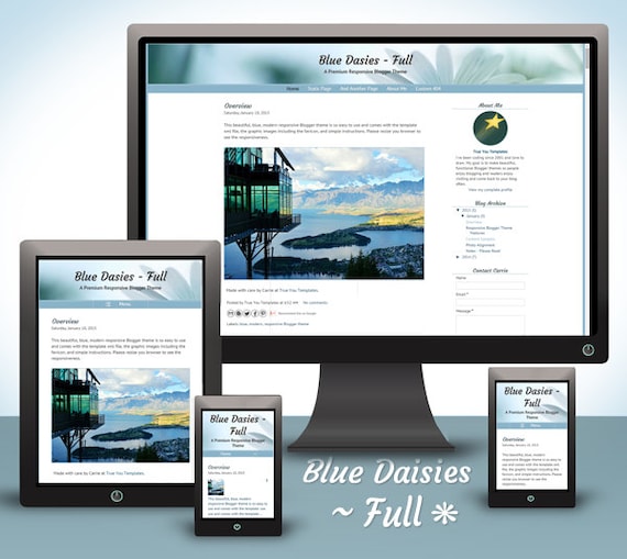
After blowing the digital dust off the blog last week (this post), I found myself contemplating its appearance. I found it very....Meh. Deciding it was time for a face lift, I did some poking around on the net to see what kind of changes had occurred during my absence, and found [unsurprisingly] a technological avalanche of TMI. Even though I had managed to post on the blog (albeit inconsistently) over the past couple of years, it was unbelievably tedious and time consuming. Trying to visit various sites to keep up with ever-changing technology with a connection that functioned at the speed of slug was nigh impossible (not enough hours in the day, and all that). I was so sad to see Google Friend Connect was gone. I tried all the tricks I could find to make it show up, to no avail. Grr. I'm guessing this is their way of *cough*cough* encouraging people to sign up for Google+. Hmph. The biggest most pressing change, however, was something called "Responsive Design". Now if, like yours truly, you've been
Obviously, if I were going to implement any changes to the blog, it would make sense to start by switching to a responsive template. Of course Blogger, which was bought out by Google around 2003, does not yet offer this feature. Pretty sure there's a whopping dose of irony hiding in there somewhere...
Anyhoo, ever a fan of the DIY project, I developed delusions of grandeur - having built my own computer "back in the day" - after reading several articles on the subject and mistakenly assumed (we all know how THAT word breaks down) I could probably figure it out on my own. Well, HaHaHa and Ha. Wasn't I just all kinds of wrong. A smart person would, of course, think to create a practice blog before implementing any kind of sweeping changes. Did I do this? Silly you. Of course not! The result? A NON-responsive blog that can be summed up in three little words:
Fruit Basket Turnover
This, in turn, generated mutterings along the lines of "Wait. What in the world is that doing there? Oh, good gravy! Where in the heck did my -- go? Uh-oh. What on earth? ARRGH!" After banging my head on the desk until I thought I might break something (namely, the desk), it occurred to me that I might need to find someone a little smarter than me to
I'll be honest here and admit that the fact that the shop had not yet had a sale gave me a moment's pause, but then again she'd only been open for a few months and I knew exactly how tough that very first Etsy sale could be (been there, done that, skipped the T-shirt). After looking through her listings, I was impressed with both the friendly tone she set and the thoroughness of her descriptions, so I decided to send her a convo and go from there. Carrie was very friendly and sent me a link to her travel blog along with her response, which made me feel a whole lot more comfortable as it made her less of a stranger. The end result? I bought one, of course, and I LOVE IT! Not only did I get a fabulous responsive template and rockin' customer service, I made a new friend :o) What more could you possibly ask for? I'm still getting things together here, but with Carrie's patient help, I've gotten a lot done already.
Look! Look! Look! I even pulled it up on my Android phone and it works like a charm. I also tried it on an iPhone, two desktops, three laptops and a netbook, and it always displayed perfectly. The template automatically (magically?) adjusted the header and body to fit neatly within the confines of the different screens; perfectly centered and everything. Awesome. *Doin' the happy dance here* WHOOP! How about it? Tell me what you pulled it up on - how'd it look? What do you think? Do you like it? I'd love to know.
As always, thank you so much for reading this far and have a blessed week!


It kind of drives me nuts how they make changes all the time. It seems to me if it's not broke don't fix it but in the tech world that just don't apply.
ReplyDeleteI like the look of the wood
Ann: Me too! Blink and it's changed completely. Seemed like every time I was able to get online to do something, the "rules" had changed or the website was new and improved and looked completely different from the previous time. So it was grumble and gripe, learn it all over again, have another long online absence from our dysfunctional ISP and...
ReplyDeleteLather, rinse, repeat. *sigh*
I can't keep up with all of the "improvements," so I don't even try unless I absolutely have to. Blogging is supposed to be fun, isn't it? It's turning into work with all of the updates.
ReplyDeleteLin: You've got that right! It's an awful lot to learn, that's for sure. Of course that's exactly why I "cheated" and bought Carrie's template (sure did make my life a whole lot easier :o)
ReplyDeleteMy home internet device is a faithful old Mac laptop.
ReplyDeleteLove the new look.